OMBRE
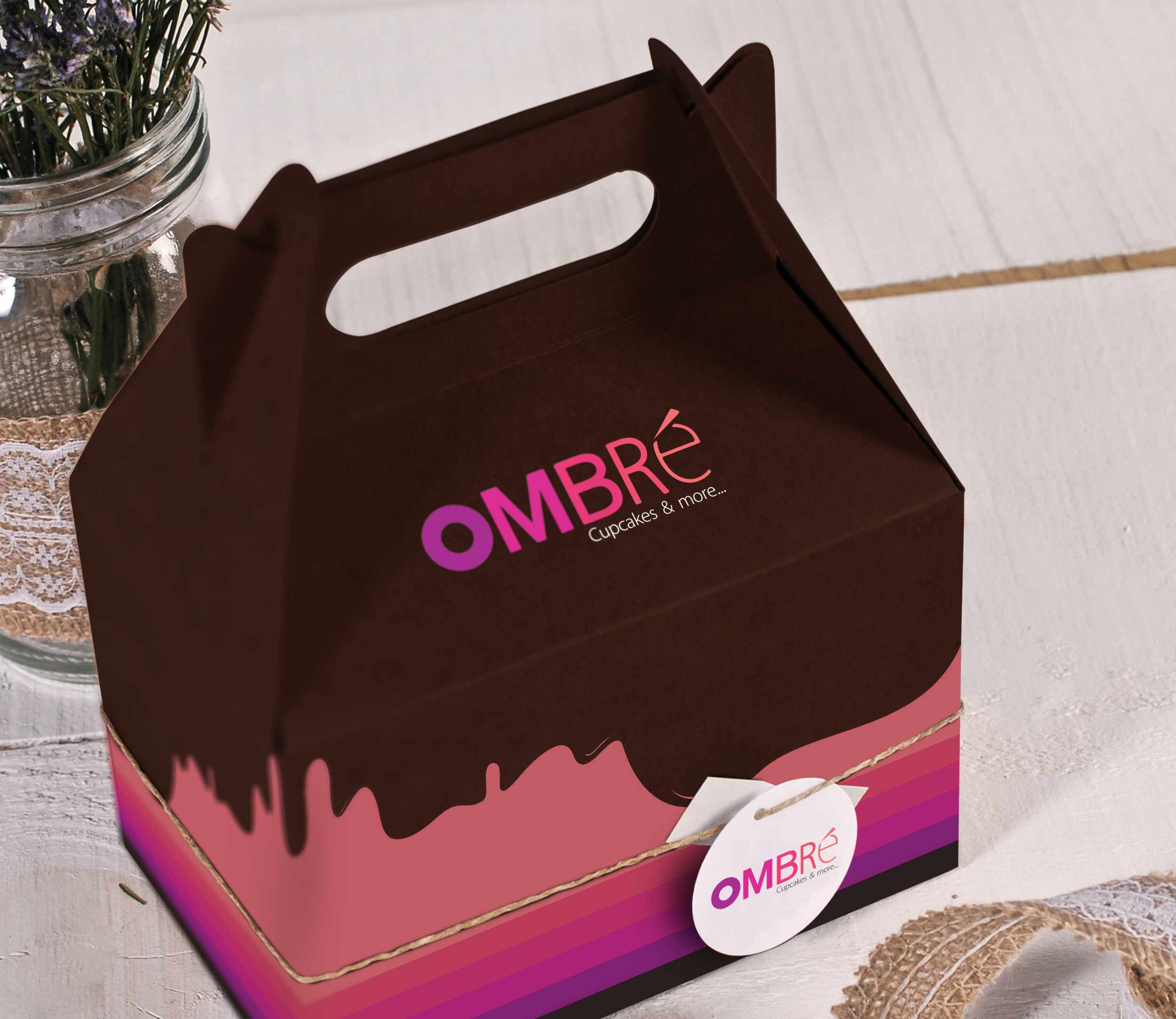
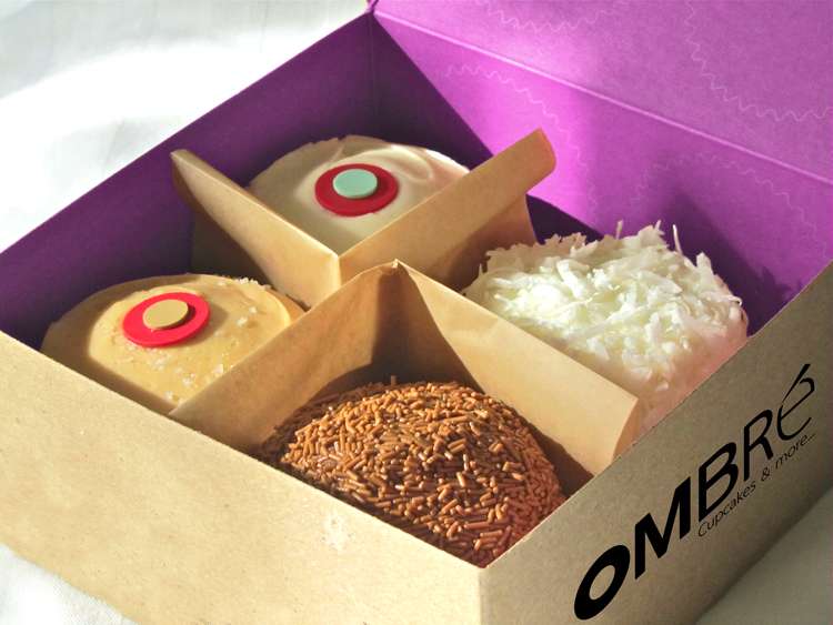
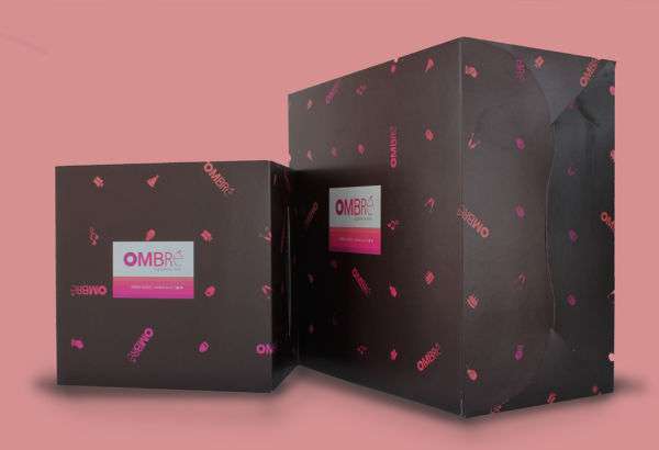
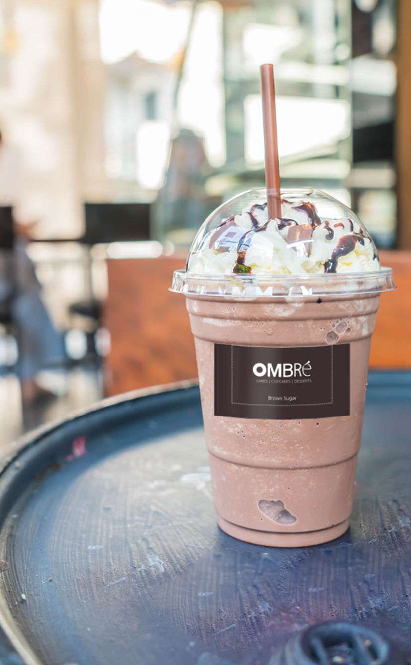
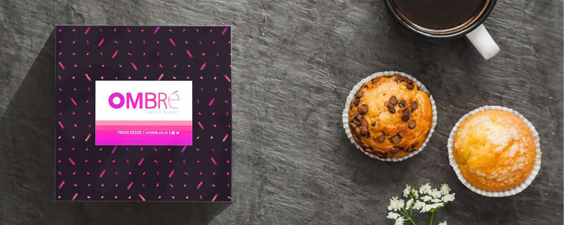
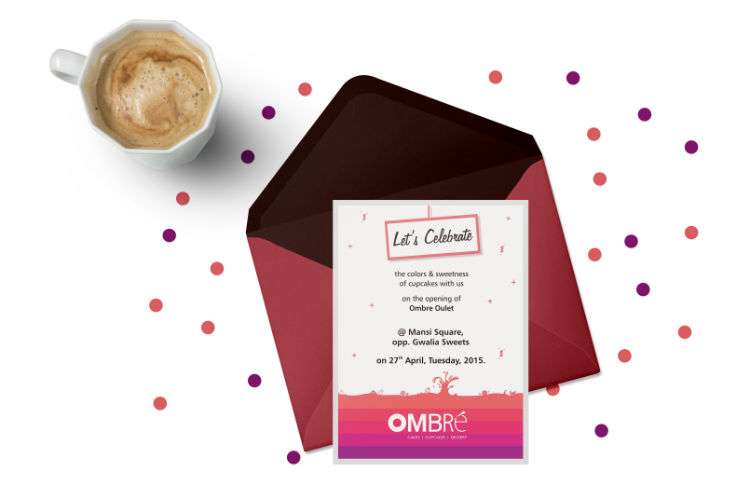
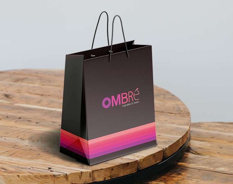
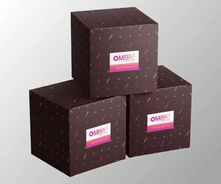
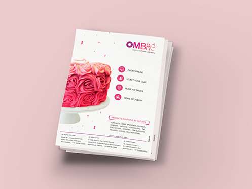
Steadfast to its name Ombre’s design has shades of colors that are normally associated with cupcakes. The merging of pink and brown into the whole design was therefore an obvious aspect. Understated and refined, the design as well as the packaging doesn’t distract from beauty and vibrancy of the products inside them which are an exciting discovery.
Services
The packaging design was a carefully considered and executed based on how far the brand wanted its outreach. All the more the reason why there isn’t much of fancy work done in the logo, deviating from the usual designs that cupcake bakeries focus on.