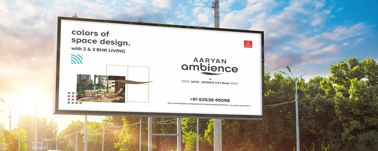
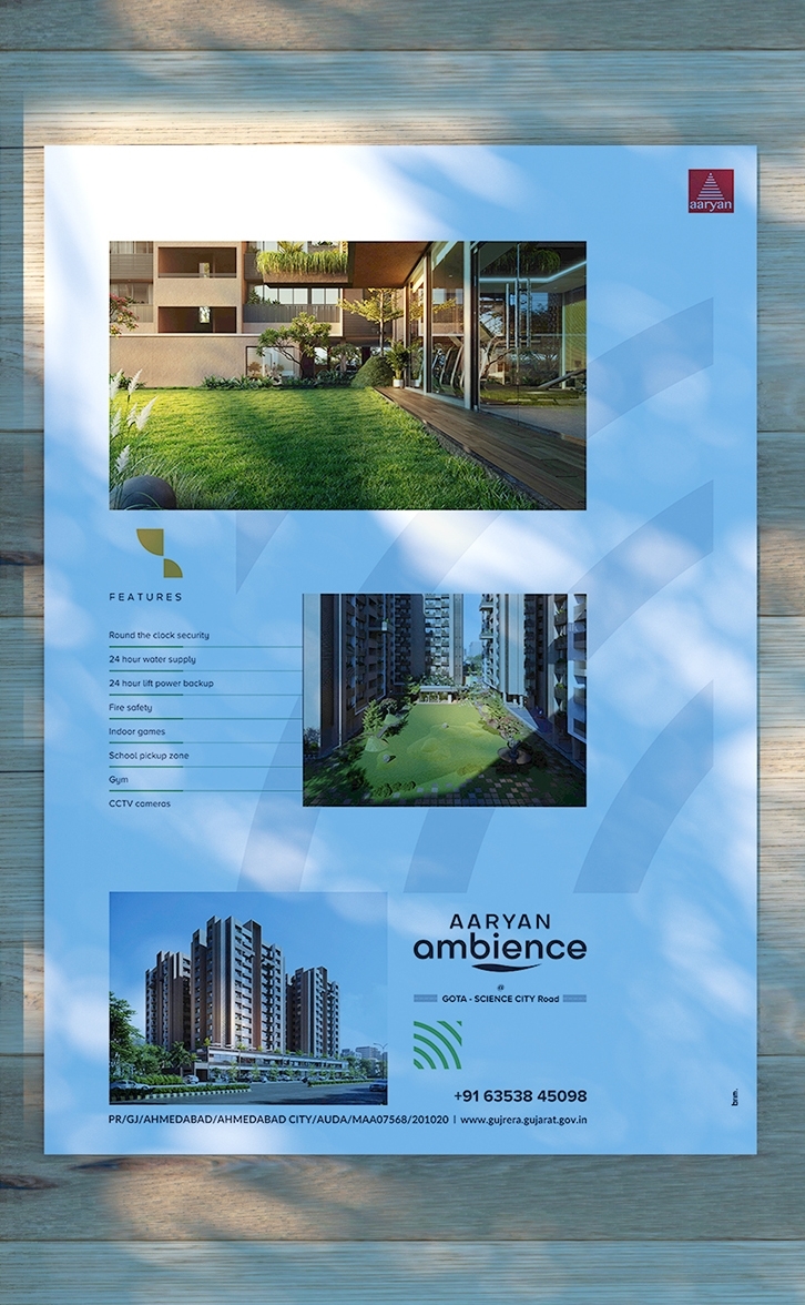
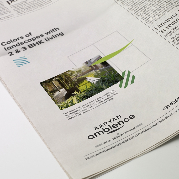
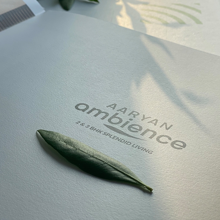
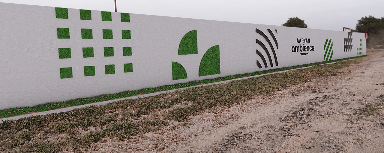
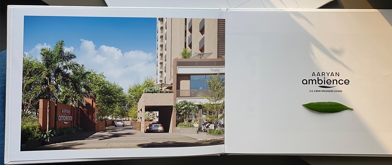
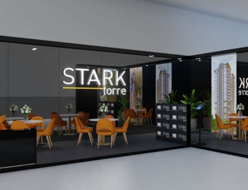
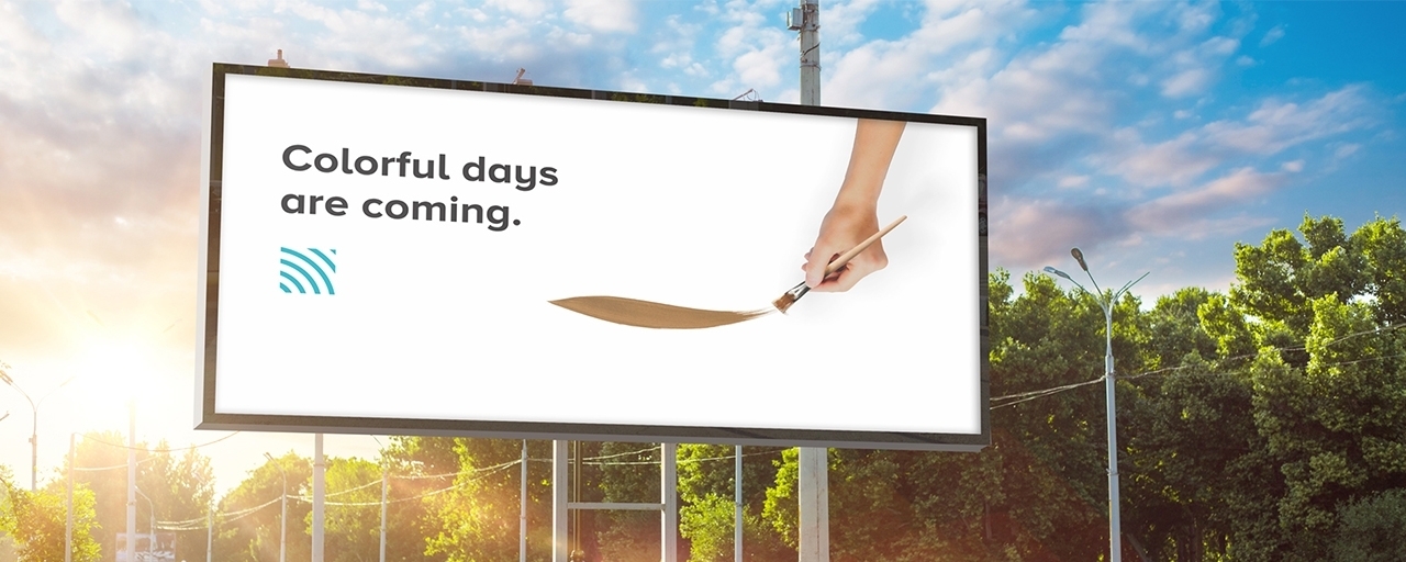
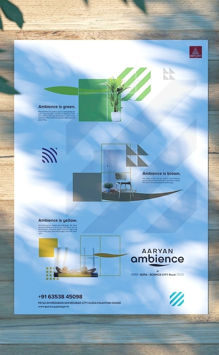
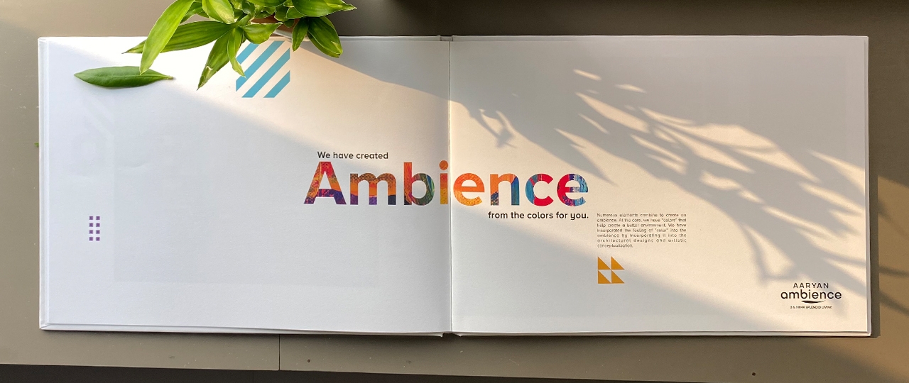
Combining architectural science with the psychology of colors may be easy for the architects to implement but will the layman understand? That was the challenge thrown in for the BRIM Team for the Aaryan Ambience project. The idea was to make it simple enough so as to not to make the buyers think that this is some white paper concept.

We first explored the relevance of moods with colors like yellow, brown & green and then earmarked them with the specific zones that Aaryan Ambience had focused on in their building design. It was a guided process without the buyers realising that we were actually doing so.

Knowing well that we had to focus on the various colors in this whole project we went for simplicity with white background and colorful text design or colored background and white text (alternating between these). This gave the buyers a clean break in viewing the website without it being monotonous.

Predominantly white background with colorful pictures made the brand stand out. This also helped us to lead the target audience into understanding the connectivity of colors, mood and design into the making of the ambience (i.e. experience). We worked closely with the context and helping the buyer to understand the whole concept through social media posts.


Extrapolating the entire theme of connectedness of design, environment, mood, colors and ambience into the different ways of branding through wayfinding signs, leaflets, brochures, newspaper advertisement, OHM Displays etc. we were able to bring a well-rounded branding solution for Aaryan Ambience and also drive home the concept within a very short time.


