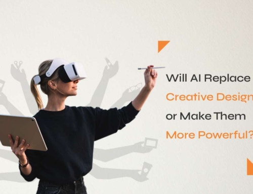
When it comes to a brand’s identity, the logo plays a pivotal role in shaping first impressions. At BRIM, our approach to logo redesign is rooted in a deep understanding of both the brand’s history and its future aspirations. Each logo we redesign reflects the core values, personality, and evolution of the company. Let’s take a look at some of our recent logo redesigns and the thought process behind each transformation.
Some of Our Projects Highlight:
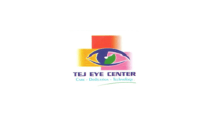
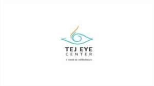
Tej Eye Center
Thought Process:
For Tej Eye Center, the redesign needed to be clean and focused, much like their approach to eye care. We incorporated circular elements to represent vision and clarity, with a refined font that speaks to the center’s advanced technology and patient-first philosophy. The result was a more professional yet approachable logo that resonated with their target audience.
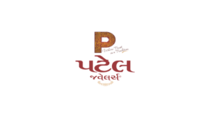
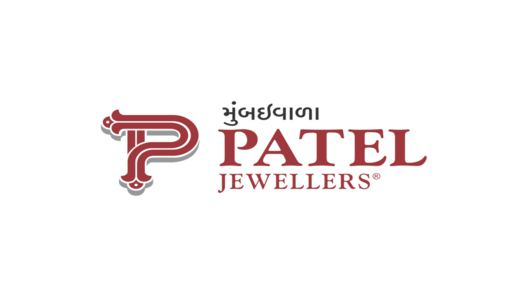
Patel Jewellers
Thought Process:
Jewelry is all about elegance and timelessness, and this was our focus while redesigning the logo for Patel Jewellers. The redesign moved away from ornate, outdated visuals to a more contemporary, minimalistic style. The new logo features delicate typography, exuding luxury and sophistication, while the golden color scheme maintains the essence of the brand’s heritage.
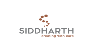
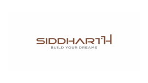
Siddharth Group
Thought Process:
For Siddharth Group, a well-established name in property development, the goal was to create a logo that reflected growth, progress, and trust. We used bold, modern typography and combined it with an upward-moving symbol to represent their continuous journey of expansion and success in the real estate industry. The new logo conveys professionalism and future-oriented vision.
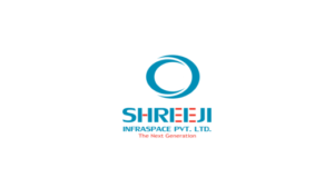

Shreeji Group
Thought Process:
For Shreeji Group, we aimed to create a logo that would represent their journey from a small local business to a reputable company in the real estate sector. The new logo balances modernity with tradition, incorporating sleek lines and a minimalist approach while maintaining the essence of their heritage.
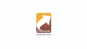
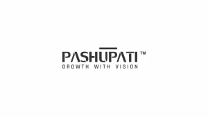
Pashupati
Thought Process:
For Shreeji Group, we aimed to create a logo that would represent their journey from a small local business to a reputable company in the real estate sector. The new logo balances modernity with tradition, incorporating sleek lines and a minimalist approach while maintaining the essence of their heritage.
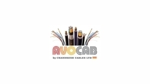
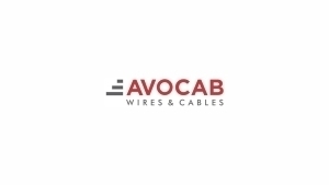
Avocab
Thought Process:
For Avocab, a leading wire and cable manufacturer, the goal was to simplify the existing logo to better align with the clean, high-tech image they wanted to project. The use of fluid, continuous lines in the redesign reflects the brand’s commitment to seamless, uninterrupted quality, while the choice of color was updated to evoke innovation and energy.
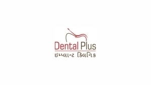
Dental Plus
Thought Process:
The redesign of Dental Plus focused on creating a more welcoming and approachable identity. The previous logo felt too clinical and detached. We softened the design elements, choosing a friendly typeface and a calming color palette that reflects trust, care, and professionalism—qualities that patients look for in a dental clinic.

To summarize, BRIM’s approach to logo redesign is more than just looks; it is about capturing the essence of a brand’s journey and future direction. By sticking to the company’s core principles and identity, we create logos that not only make a lasting impression but also act as a powerful sign of the brand’s evolution.
Ready to elevate your brand’s identity? Contact us at BRIM to start your logo transformation journey today!